As many of us are aware, LIC has been changing in recent decades – experiencing an influx of new housing, higher rents and new community members. But just what does that development look like? Below are some facts and figures that help illustrate these changes. As Paula Crespo, Senior Planner at the Pratt Center for Community Development recently stated during a Community Meeting presentation (Monday, October 13, 2017), these figures increasingly tell the story of “a tale of two Long Island Cities – one south of the Bridge, and one north of Bridge”.
In the data and graphics we have organized [1], we highlight how housing cost and density in the neighborhood has changed from 2000-2015 and look at who is living in the neighborhood today (using 2015 figures) by comparing four geographies: New Development, NYCHA, No ND & NYCHA, and All. “New Development” refers to the area south of the Koch Bridge which has seen the largest growth of new development in recent decades (census tracts 1,7 and 19 – the red circle on the map). NYCHA includes Queensbridge Houses and Ravenswood Houses – (census tracts 25 and 47 respectively – the blue circles on the map). No ND & NYCHA includes community members living in homes that are neither NYCHA nor “New Development” (No ND & NYCHA). And “All” looks at the numbers for this area combined, which shows what LIC might seem like if the data is not parsed by geography.
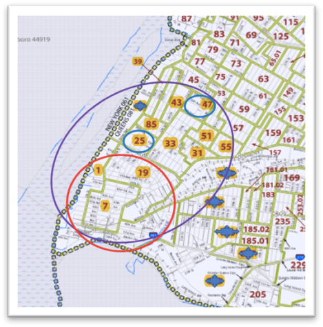
The tracts included in this analysis – 1, 7, 19, 25, 31, 33, 39, 43, 47, 51, 55, 85 – are highlighted in yellow on this map.
Look at the Data:
NOTES:
[1] The data and charts herein was collected by the Census Bureau and includes the following datasets: 2015 ACS 5 Year Estimates, 2010 ACS 5 Year Estimates, 2000 Census Data. This data was pulled and organized by Kristen Hackett, Steering Committee member of the Justice for All Coalition and Doctoral Candidate in the Environmental Psychology Program at the CUNY Graduate Center.